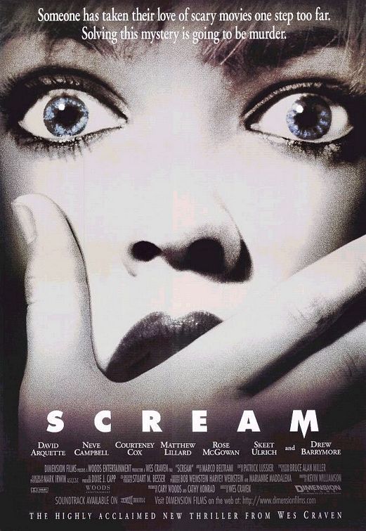
The poster I have decided to analyse is Scream. The poster is the main poster. The poster has conventional layout as it feature a main image, the name of film, a tagline, the name of the main actors and director and film credits.
The main image is close up of a women’s face, this fully shows the women facial expression. She looks very scared and vulnerable as she has her hand over her mouth, which highlights as if see have just seen something that’s shocked her. Or it could even be someone else’s hand that is covering her mouth to stop her from screaming which relates to the title of the film. The camera shot of the main image is unconventional as most posters are usually a medium shot. The main image is in black and white, which results in her skin looking very pale and ghostly. The colours black and white could represent death or darkness. The only part of the main image which is in colour is the woman’s blue eyes. The audience immediately focuses your attention on the main image and highlights the fear in women’s eyes.
The colours used on this poster are black and white. The colours contrast or opposite against each other. Black and white is very common colours on horror posters. Black has connotes death, evil and mystery and black in the background of the poster may hint at the narrative of this film. On the other hand, white has a more positive meaning and connotes innocence and vulnerability which highlights the personality of the woman on the poster, as she looks very scared.
The tag line “someone has taken their love of scary movies one step too far. Solving this mystery is going to be murder” has been placed at the top of the poster which follows the conventions of film posters. It has been written in white writing which contrasts against the black background, drawing more attention to it. The tag line also has connotations of tragedy through the use of the word “murder”, which hints at the narrative of the film, and suggests that there will be an element of death within this film. The words “scary movie” also highlights the fact that this film is a horror/thriller film and suggests that it is very scary. However, the tagline doesn’t follow convention of a film tagline as it is not short and catchy which result in it not being memorable.
The film title “Scream” has been placed between the middle and bottom of the poster which follows the conventions of most film posters. It has been written in bold white writing which contrasts against the black which immediately grabs the audience’s attention. The word scream usually associated with fear, suggesting the film narrative, scary events will take place in this film. The font of the title is mostly simple to ensure that it doesn’t draw attention away from the main image. However the letter “M” on the end of the title is written slightly different from the rest of the title. The middle point on the “M” is slightly longer than the rest of the title; this imitates the point of a knife and hints and the narrative of this film.
The actor names have been written on film poster, as many of them are well known. However its placing in a unconventional as usually the actors name are at the towards the top of the page. At the bottom of the page there is further text which reads, 'The highly anticipated thriller from Wes Craven.' Wes Craven is a well known horror film director would appeal to audiences who enjoy horror films. This is another
The Target Audience for would be both men and women, between the age of eighteen and thirty. I believe the poster is successful as it uses colours associated with horror, black and white. The main image feature a women looking vulnerable and scared with is which is also usually associated with Horror. However the only thing a feel that is not effective about the poster is the tagline which I feel is slightly too long resulting in it not being very memorable.
No comments:
Post a Comment