Monday, 19 March 2012

Ideas for Mise-en-scene

Make up 


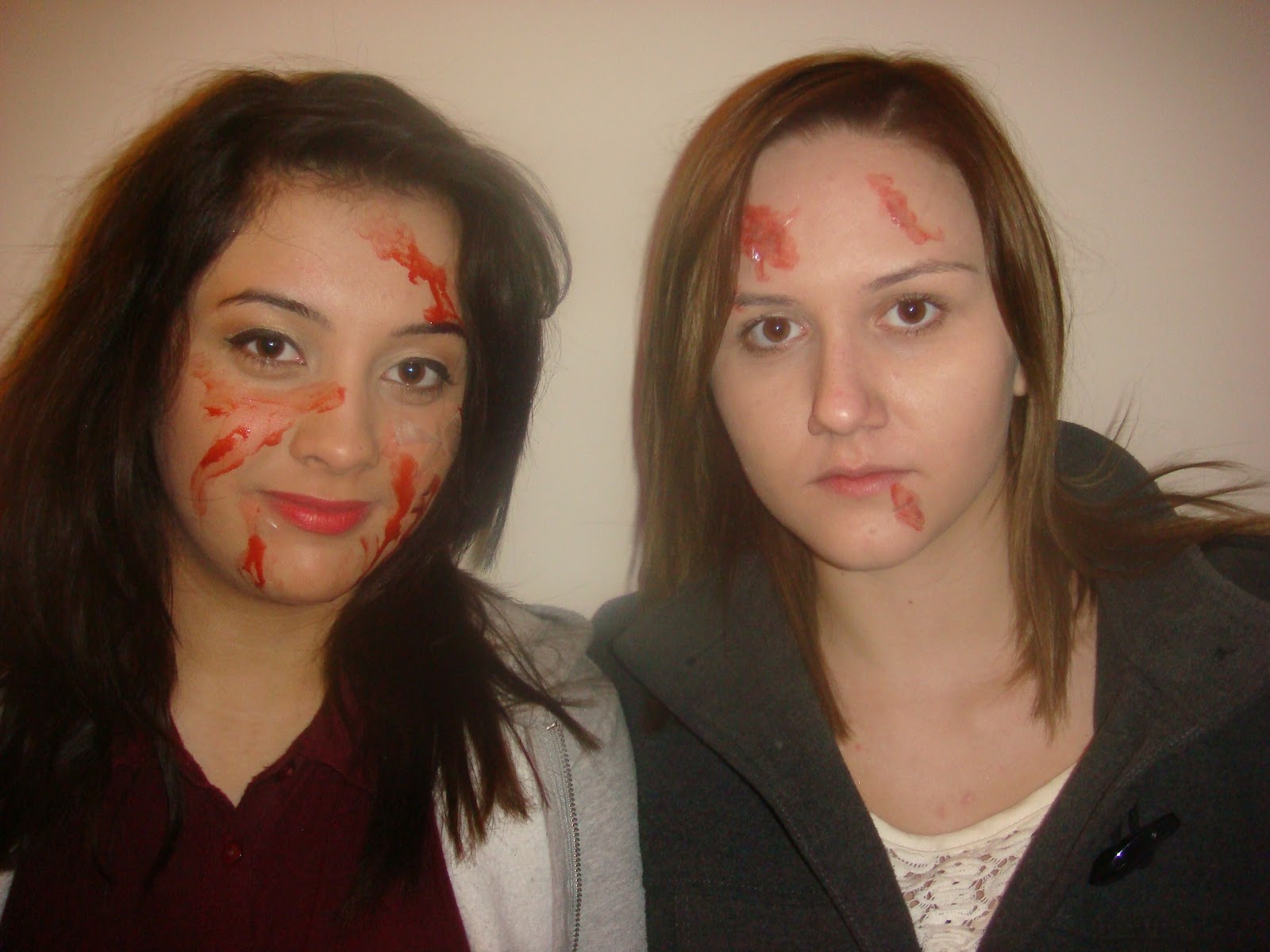
Car crash- Make up

Before:

After : 


Fake Blood and cut up plastic - Used for car crash scene to look like blood and glass from a car.

Hair, make up costume for Hospital Scene


Make Up-Adding pale foundation, pale lipstick and brown eye shadow around her eyes- to make her look ill


Make Up- Adding fake blood and fake cuts- For after the car crash


Hair and Make up and Costume - Ghost 

Costume- White smock/dress

Make up- black eyeshadow around her eyes, fake blood, pale foundation and pale lipstick 


Hair and Make up- Film Magazine Front Cover 

Before: 


 curled  hair and adding hair extenstions and black dress


Adding foundation and bronzer
Adding red lipstick and Marsacra

After :

Music Ideas for Film Trailer


Film Poster Ideas

Idea 1:

The image was medium shot of the protagonist looking scares looking over her shoulder, while in the antagonist is in the background looking at directly at her . The film title – “ Fractured” will be at the top of the page. The font of fractured will have a broken/scatted theme. The tag line – “ I know what you did to me would be between middle and bottom of the page in red- to signify blood.

Idea 2:

The  main image is a medium Birdseye view shot of the protagonist looking scares in hospital bed wearing hospital robes and a breathing tube with cuts and bruises on her face. Again with the film title – “ Fractured” will be at the top of the page. The font of fractured will have a broken/scatted theme. The tag line – “ I know what you did to me would be between middle and bottom of the page in red- to signify blood.

We decided to use idea 1 as it shows both characters which featured in the film.

Film Trailer Ideas

We decided are trailer narrative, would be similar to begins with the laying out the basis of the story. In middle of the story develops further and usually ends with a dramatic climax. Finally the last part of the trailer consists of a visual montage showing powerful and emotional moments of the film. Until a blackout the audience experience ‘The string’ which is the finial clip in the trailer which is meant to frighten the audience.

Our trailer will be very similar to are film narrative however it does reaveal the whole narrative.

Trailer Narrative: 

Two friends are involved in a tragic accident. One is killed almost instantly. The other sustains serious injuries and is left in a coma for eight and a half months. When, against all odds, she awakens from the coma, she cannot remember anything about the accident, but feels both grief and guilt in response to finding out her friend has died. Before long, however, she starts to experience flashbacks, recalling the more tragic parts of the accident. Something doesn’t seem right as certain elements of her flashbacks do not seem to make sense or do not seem to tie in with the version of events the hospital filled her in with. The situation becomes worse, when supernatural occurrences begin to haunt the girl, as she witnesses ghostly apparitions and is visited on a regular basis by visions of her dead friend that are terrifying. The girl is convinced that her friend is enacting revenge on her because she has survived and not suffered death like the friend herself.

Film Magazine Ideas

Our target audience for our film is female, however the majority of film magazines are specifically target the male audience. Where the main image on the magazine is a male character from a film, the magazine is promoting. main images with females rarely appear, if they do the image it is usually the image of actress than a character she plays. The female look attractive and ‘sexed up’  which appeals to male target audience of the film magazine.  

Therefore we have decided to create a film magazine with target audience is male and have our main image of the actress looking ‘sexy’ which would satisfy the specific target audience. This includes sell line promoting films which male would watch, such as action films.

Film Magazine Analysis 2


The film magazine front cover I am analysing is ‘Empire Magazine’. The magazine is advertising the film ‘The Shinning’.

The masthead says ‘Empire’ as the magazine is called ‘Empire Magazine’. The name Empire suggests power and domination as if the Empire is the best magazine and only film magazine worth reading and far superior to any other film magazine. The size of the masthead takes up the upper section of the magazine. ‘Empire’ is written in a large bold red font. The typography is eye catching but simple. The simplicity and use of the colour red reflects Empire magazines target audience which is men. As men prefer images and, and text which is minimalistic and basic. The colour red connotes danger, strength and power which the male target audience can relate to as they are ‘macro’ masculine.  And like films elements of danger, strength and power in them which empire promotes. The masthead creates brand identity the same font colour and size is on every front cover in the same position at the top of the magazine.

The main image is of a man looking through a broken door. The camera shot is close up of Jack’s face, showing anger facial expression.  This face stands out within the image as its tanned in contrast to grey/white door. His eyes are to the side focusing on something. His teeth are very white contrasting with the black shadows on his face. Showing his teeth are signs of anger and rage making the man seem very menacing. The main image relates to the main sell line which is 'The 500 Greatest Films of All Time'. As the shinning is widely regarded as one of the greatest films of the horror genre and a staple of pop culture. The main image is from the iconic famous scene where Jack sticking his face through the broken door. From the main image it suggests the film is ‘dark’ and scary as Jack looks deranged.  Either a horror film or thriller. There is a symbolic link between magazine image and the film and DVD poster of the film. As they all have the image of the Jack sticks his face through the broken door.

The magazine main sell line is, 'The 500 Greatest movies of All Time' as the front cover is a limited collector’s addition. The sell line highlights the main image, expressing the shinning is one of the greatest films of all time. The sell line reflects the interest of the target audience, as the audience who buy Empire are film lovers and would be every interest in knowing 'the 500 greatest movies of All Time'. within the sell line the number ‘500’ if much larger the rest of text, highlighting the large about of content the reader will get, if the by the magazine. The word movies in the sell line tell us the genre of the magazine. The sell line is in 3d and slightly overlapping the above the masthead. The sell line is white, making it stand out against the background.

The other sell line is ‘100 covers to choose from! Turn to page six to see all 100>>>’ the sell line is in a puff, giving the audience something extra, the sell line also does not reveal everything about of the cover, the mode of the address is enticing, making the audience to buy the magazine so they can turn to page six to find out the surprise. The puff is a square this reflects the male target audience as male prefer text placed in boxes. The use of the box highlights the text making it stand out more. The arrows in the sell line entice are pointing side of the magazine telling the reader to open the magazine. The typography of the sell lines are simple, bold and are in capitals making the text look strong which the men can relate to. 

On left hand side on above the main image the sell line says  "I'm not gonna hurt ya.. I'm just gonna bash your brains in" this is something to attract the reader to the film”. This is a famous quote from film. This relates the main image, telling the reader the jack in main image looks angry.  As the text is on the side in a simple black font it doesn’t distract to the main image but enhances it. Underneath is a another piece of  sell line which say ‘The shinning’ this introduces the reader to the main image, that it is a image from shining and it also relate to the top sell line 'the 500 greatest movies of All Time’. The typography is in bold, in capitals making it stand out.

Within the magazine they only use four colours Red, black, little brown and white, The background of front cover is black; this contrasts the images and sell lines making the writing more prominent and striking. They have used to around the edges of the main sell line, main image and puff  to make them stand out,  The use of  the colour red within magazine suggest the genre of the film as it connotes blood and anger.


Film Magazine Analysis 1


The main image is of actress Megan Fox, she also known for her beauty as have been voted ‘sexiest’ female in the world in many men’s magazines. In the image she is posing in provocative way. Megan Fox is kneeling, topless only skin-tight leather trouser, which show her full body figure. The image appeals to male target audience, as they would find her attractive. The image re enforces stereotypes of women being an object for men to gaze over and that sex sells. In the main image you can see Megan Fox’s tattoos and messy hair, which shows she not just a ‘pretty face’ she has a darker wilder side which appeal to male readership. The main image is unconventional usually; the main image is a male character from the film, while the main image is the Megan Fox and not her character, in the film she is promoting. They are trying the sell the magazine issue through her sex appeal rather then promoting the film through her character. The main image relates to the mail sell line, the describe this magazine issue as the “hot issue”, describing as “hot” which is slang word for what man would call a good-looking women. The image relates to literal meaning of hot as Megan Fox is wearing minimal clothing she is could be feeling the heat. The main image does not suggest anything about the narrative of the film, as the image of her Megan Fox not her character, which goes against the typical codes and conventions of a normal magazine. As the main image is of Megan Fox and not a character, there is no symbiotic link between the film poster, and the magazine image.
The magazines image long shot breaking the conventions of a film magazine, usually the shots are mid shot. The image maybe a long shot instead of mid shot as the image is of a female actress and not a character, with a long shot, it shows are minimal clothing which would attract male target audience to buy the magazine. The main light is coming from the white background making the main image stand out. Her face as less lit compared to her top half of her body, this drawing the audience to fact that see is topless, attract the male target audience.

The masthead says ‘Empire’ as the magazine is called ‘Empire Magazine’. The name Empire suggests power and domination as if the Empire is the best magazine and only film magazine worth reading and far superior to any other film magazine. The size of the masthead takes up the upper section of the magazine. ‘Empire’ is written in a large bold red font. The typography is eye catching but simple. The simplicity and use of the colour red reflects Empire magazines target audience which is men. As men prefer images and, and text which is minimalistic and basic. The colour red connotes danger, strength and power which the male target audience can relate to as they are ‘macro’ masculine.  And like films elements of danger, strength and power in them which empire promotes. The masthead creates brand identity the same font colour and size is on every front cover in the same position at the top of the magazine.

The main sell line which grabs the audiences’ attention first read “The Hot Issue… Megan Fox.” This relates to the main image which is Megan Fox. The sell-line reflects the interest of the target audience as many readership would fine her attractive. Underneath the sell line there is tagline which says “one on one with Hollywood with the most wanted women in Hollywood” this lure the target audience, as tagline suggest they are the only ones going to be able to read this interview. The largest font for the sell line is “Megan Fox” allowing name to the main image.  “the hot issue” and “Megan Fox” are in the same colour and same font, the magazine are suggesting Megan is “hot” On top of “Megan Fox” in small bold writing says “transformer’s 2” relating to the film Megan is acting in, however that is the only time the film is mention showing the sell-line are focusing on Megan Fox and not transformers the film or her character in the film.

The first smaller sell line include “Three sizzling Exclusive”  “Wolverine, Star Trek Angel and Demons. The sell line is placed in the bottom left hand side corner, so it does not distract from the main image and main sell-line. The sell lines reflect the interest of the target audience as they would these films. They also have three related images showing characters of films which feature in the sell lines. The mode of address lures the target audience, using the word “ exclusive” this suggest the TA will not be able to get the information on the films anywhere else but in this issue of Empire. The font is of sell line small and is the same size as the front as “the transformer’s 2”. This does not distract from the main image and main sell-line.

The second smaller sell line is on a banner in right hand over slightly covering the master head. “Tron rebooted” The selling relates to action film Tron. This again doesn’t distract from the main sell line image and sell line.

The colours used in the sell line are blue white black and grey with the pain and simply fonts which would appeal to a male audience. When the sell lines are focusing on the film they use blue and white which are brighter colours lure to TA to the sell line. The main sell line is in grey which makes it stand out against the white background. 

The layout of magazine is image heavy which appeals to male who response more to visuals. The layout is very effective as they have large image of one the most attractive women, semi nude on the front which would make the TA by the magazine. The front cover does follow convention as most main images and sell lines focuses on the film and sow a character from the film, while this magazine focuses on Megan fox and the main sell-line only briefly mentions transformers the film and mainly focuses on Megan as an actress.